 |
Cheat Engine
The Official Site of Cheat Engine
|
| View previous topic :: View next topic |
| Author |
Message |
CrisNMP
Fun Supervisor
 Reputation: 16 Reputation: 16
Joined: 11 Apr 2007
Posts: 4649
|
 Posted: Fri May 29, 2009 9:58 am Post subject: Posted: Fri May 29, 2009 9:58 am Post subject: |
 |
|
| r34p3r wrote: | | Not many people know what a traced bitmap looks like. The messy lines were intended to give a graffiti feel. A very base feel at least. Thanks for the comments though. Acknowledged. |
Actually I know, I've been using Flash for longer than you. The messy lines like I said can make it look rough(which is fine in the small version) but when viewed in the large one it just looks messy and useless.
http://i191.photobucket.com/albums/z237/j_eme/LaFizzykicks.png
Look at it again, re-read both of my posts and if you still don't understand then I'll circle the parts that fuck it up.
This is not an argument, is whats wrong with your logo imo and what Holland was most likely trying to say.
_________________

BENBENBENBENBENBENBENBEN
Last edited by CrisNMP on Fri May 29, 2009 11:49 am; edited 1 time in total |
|
| Back to top |
|
 |
Cheat Engine User
Something epic
![]() Reputation: 61 Reputation: 61
Joined: 22 Jun 2007
Posts: 2071
|
| Posted: Fri May 29, 2009 11:08 am Post subject: |
|
|
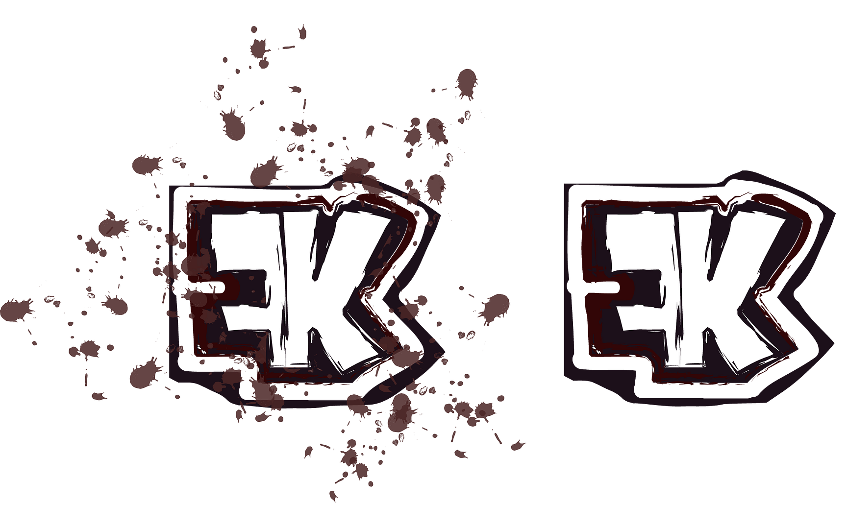
| Clairenix wrote: | | Chidori wrote: | | r34p3r wrote: | | Holland wrote: | | r34p3r wrote: | I guess it would of been nice if it had been a surprise but not to be unfair to you:
Large Version: Please click.

Small Version
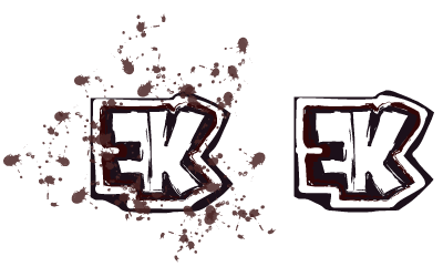 |
Not really something I'd use for a logo. |
Then you don't clearly understand the corporate and commercial side of logos. |
he probably says that because of the splatters |
The colors are unattractive imo. |
All of the above. The colours are supposed to attract the possible client to draw his attention and making him feel like buying the stuff. You do this by using appropriate colours according to the product, (Chocolate usually has brown, milk has white and blue, and candy or such use bright, young colours, to attract smaller children). What you did, was make an aggressive piece of art, which is cool, but not really something you should use as a logo.
|
|
| Back to top |
|
|
Chidori
Grandmaster Cheater
![]() Reputation: 1 Reputation: 1
Joined: 25 Apr 2008
Posts: 691
Location: Canada
|
| Posted: Fri May 29, 2009 3:27 pm Post subject: |
|
|
| that is true color has alot to do with things,hospitals are painted white because they make you feel clean
|
|
| Back to top |
|
|
r34p3r
Grandmaster Cheater Supreme
![]() Reputation: 3 Reputation: 3
Joined: 05 Jul 2007
Posts: 1368
Location: Australia
|
| Posted: Fri May 29, 2009 5:03 pm Post subject: |
|
|
| Holland wrote: | | Clairenix wrote: | | Chidori wrote: | | r34p3r wrote: | | Holland wrote: | | r34p3r wrote: | I guess it would of been nice if it had been a surprise but not to be unfair to you:
Large Version: Please click.
Small Version
|
Not really something I'd use for a logo. |
Then you don't clearly understand the corporate and commercial side of logos. |
he probably says that because of the splatters |
The colors are unattractive imo. |
All of the above. The colours are supposed to attract the possible client to draw his attention and making him feel like buying the stuff. You do this by using appropriate colours according to the product, (Chocolate usually has brown, milk has white and blue, and candy or such use bright, young colours, to attract smaller children). What you did, was make an aggressive piece of art, which is cool, but not really something you should use as a logo. |
I actually modelled the pallete on Cola Bottles and other dark confectionery. I am not sure if you thought I used bitmap trace, Cris, but I didn't. I used types of strokes from AI, I'll send you the file if you want. If that is not what you meant I'm sorry. What I was saying was that not many people know what a bitmap trace looks like. Sure, that might not change the look but maybe that's what you're basing your criticism on. Maybe not, I did acknowledge what you had said and I did think about it. I did a bit of research with those colours and I found they contrasted well and stood out against other brighter colours, such as those they might have been placed next to you in a store. Children don't always pick the brightest coloured sweets, they pick the one which "stands out" and looks "good". Dark colours are associated with all different types of sweets, chocolate is just one of them. Sure, it might look messy, but it does have a bit of research behind it.
| Quote: |
My entries:
The reason why I have presented two logos as to one is due to the fact that the company may want to present itself differently at certain events. The image to the left is designed for a confectionery product. With a slight fizzy effect as to link the company to the image, and to remind people of the link between the company and Cola Bottles. The second logo is designed for more strict environments. An annual business report or presentation, perhaps. Both incorporate colours of sweets, such as cola bottles and other dark confectionery.
My methods:
I firstly found a font which suited the style I was aiming for. Showcard Gothic turned out to be an appropriate script. I then thinned the letters so as to create a smoother meld between the reversed F and the K. I then outlined the text and then outlined the entire thing.
After that I found appropriate brushes and stroke sizes. I matched the colours you'd find in confectionery and used those as my colour pallete. |
This does not justify the things which you find wrong with it but don't forget that you are not small children.
|
|
| Back to top |
|
|
|
|
You cannot post new topics in this forum
You cannot reply to topics in this forum
You cannot edit your posts in this forum
You cannot delete your posts in this forum
You cannot vote in polls in this forum
You cannot attach files in this forum
You can download files in this forum
|
|