| View previous topic :: View next topic |
| Author |
Message |
w1nd1n6s
Advanced Cheater
![]() Reputation: 2 Reputation: 2
Joined: 22 Sep 2009
Posts: 51
|
 Posted: Tue Jul 05, 2011 11:37 pm Post subject: The Evil Clown Posted: Tue Jul 05, 2011 11:37 pm Post subject: The Evil Clown |
 |
|

Need some Proper CnC's for this one  which do you preffer? which do you preffer?
|
|
| Back to top |
|
 |
atom0s
Moderator
 Reputation: 198 Reputation: 198
Joined: 25 Jan 2006
Posts: 8517
Location: 127.0.0.1
|
| Posted: Wed Jul 06, 2011 6:47 am Post subject: |
|
|
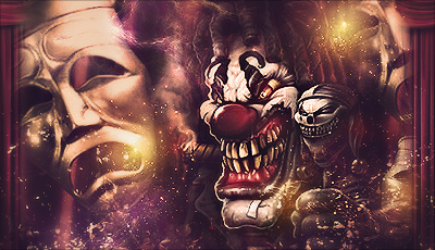
Top:
The face looks really good. However the background looks a bit off for that style of picture. Given that its more grunge then anything, but the face doesn't really fit well with that background.
Bottom:
Think this one looks better overall. The background and slight border go better with the face(s).
_________________
- Retired. |
|
| Back to top |
|
|
Daniel.
I post too much
![]() Reputation: 72 Reputation: 72
Joined: 08 Nov 2007
Posts: 2938
|
| Posted: Wed Jul 06, 2011 10:27 am Post subject: |
|
|
Still using the same style, repetition in siggys is bad
_________________
|
|
| Back to top |
|
|
InternetIsSeriousBusiness
Grandmaster Cheater Supreme
 Reputation: 8 Reputation: 8
Joined: 12 Jul 2010
Posts: 1269
|
| Posted: Wed Jul 06, 2011 11:16 am Post subject: |
|
|
| Daniel. wrote: | | Still using the same style, repetition in siggys is bad |
How can it be bad? It is not like anyone is forced to use them, so who gives a fuck if he uses the same style?
On topic:
The top one is better in my opinion. It also looks scarier.
_________________
FLAME FLAME FLAME!!!@@@ |
|
| Back to top |
|
|
Daniel.
I post too much
![]() Reputation: 72 Reputation: 72
Joined: 08 Nov 2007
Posts: 2938
|
| Posted: Wed Jul 06, 2011 11:16 am Post subject: |
|
|
| [readegamingfaggotrname] wrote: | | Daniel. wrote: | | Still using the same style, repetition in siggys is bad |
How can it be bad? It is not like anyone is forced to use them, so who gives a fuck if he uses the same style?
On topic:
The top one is better in my opinion. It also looks scarier. |
It gets boring to look at
_________________
|
|
| Back to top |
|
|
InternetIsSeriousBusiness
Grandmaster Cheater Supreme
Reputation: 8
Joined: 12 Jul 2010
Posts: 1269
|
|
| Back to top |
|
|
Daniel.
I post too much
![]() Reputation: 72 Reputation: 72
Joined: 08 Nov 2007
Posts: 2938
|
| Posted: Wed Jul 06, 2011 11:54 am Post subject: |
|
|
| [readegamingfaggotrname] wrote: | | Daniel. wrote: | | [readegamingfaggotrname] wrote: | | Daniel. wrote: | | Still using the same style, repetition in siggys is bad |
How can it be bad? It is not like anyone is forced to use them, so who gives a fuck if he uses the same style?
On topic:
The top one is better in my opinion. It also looks scarier. |
It gets boring to look at |
Since we are in the art section, how bout tell you something.
Most painters paint the same type of style all the time too. But you want to know why? They are really good at it! When painters paint, the intention is not for the same people to see her paintings every time she or he makes a new one! But that is what has happen here. You have seen a decent artist's work too many times, so you are calling it bad? If you say that is bad, then you should look at yourself.
It is not like this is any better either:
 |
wow you're an idiot, I never said it was bad, I'm saying he should try and switch the style, it's like looking at the same picture over and over again
EDIT: He wants CnC, and I'm giving it to him
_________________
|
|
| Back to top |
|
|
Dillonz
Grandmaster Cheater
 Reputation: 4 Reputation: 4
Joined: 20 Jan 2008
Posts: 758
Location: Under your bed
|
| Posted: Wed Jul 06, 2011 11:39 pm Post subject: |
|
|
| Your style started out nice but it has turned to effect spam and too many things to look (Focal please). I do however enjoy some of your older works from this thread: http://forum.cheatengine.org/viewtopic.php?t=535668.
|
|
| Back to top |
|
|
w1nd1n6s
Advanced Cheater
![]() Reputation: 2 Reputation: 2
Joined: 22 Sep 2009
Posts: 51
|
| Posted: Fri Jul 08, 2011 12:23 pm Post subject: |
") |
|
| Guys please cnc the Art work not me thanks
|
|
| Back to top |
|
|
Daniel.
I post too much
![]() Reputation: 72 Reputation: 72
Joined: 08 Nov 2007
Posts: 2938
|
| Posted: Fri Jul 08, 2011 12:35 pm Post subject: |
|
|
We are CnC'ing the art, if you don't want our critique then get out
_________________
|
|
| Back to top |
|
|
w1nd1n6s
Advanced Cheater
![]() Reputation: 2 Reputation: 2
Joined: 22 Sep 2009
Posts: 51
|
| Posted: Fri Jul 08, 2011 1:07 pm Post subject: |
|
|
| Daniel. wrote: | | We are CnC'ing the art, if you don't want our critique then get out |
well not really,its not like that, but i would like to see some comments about its Light ,Depth etc... 
|
|
| Back to top |
|
|
Dillonz
Grandmaster Cheater
Reputation: 4
Joined: 20 Jan 2008
Posts: 758
Location: Under your bed
|
| Posted: Fri Jul 08, 2011 11:31 pm Post subject: |
|
|
| w1nd1n6s wrote: | | Daniel. wrote: | | We are CnC'ing the art, if you don't want our critique then get out |
well not really,its not like that, but i would like to see some comments about its Light ,Depth etc... |
The first one has more depth than the second. However, the random lights in the first one slightly ruin it. In the second one there are too many things to look at and the mask appears to be a space filler or something.
|
|
| Back to top |
|
|
gaming04
Expert Cheater
![]() Reputation: 0 Reputation: 0
Joined: 06 Dec 2010
Posts: 186
|
| Posted: Fri Aug 05, 2011 12:28 pm Post subject: |
|
|
I have to agree with Dilonz, here. On first look at your older pics, I fell in love with them, but my first look at your new art here just screams...ghetto. It looks to me like these two were meant to show intimidation. Probably well done in that aspect, I think. But I can't feel it, though...
|
|
| Back to top |
|
|
Drezer
Grandmaster Cheater Supreme
 Reputation: 0 Reputation: 0
Joined: 23 Jan 2008
Posts: 1111
Location: Bonechewer(WoW)
|
| Posted: Fri Aug 05, 2011 1:00 pm Post subject: |
|
|
bottom one has less crazy shit on the sides which otherwise would divert your attention away from the clowns.
good work on both though
_________________
|
|
| Back to top |
|
|
|


