| View previous topic :: View next topic |
| Author |
Message |
sneakerhead
Master Cheater
 Reputation: 1 Reputation: 1
Joined: 10 Sep 2009
Posts: 385
|
|
| Back to top |
|
 |
Moments
Grandmaster Cheater Supreme
![]() Reputation: 17 Reputation: 17
Joined: 20 Mar 2008
Posts: 1196
|
 Posted: Wed Jun 30, 2010 2:33 pm Post subject: Posted: Wed Jun 30, 2010 2:33 pm Post subject: |
 |
|
| Overused motion blur effect? >:
|
|
| Back to top |
|
|
1929394839292057839194958
Grandmaster Cheater Supreme
![]() Reputation: 130 Reputation: 130
Joined: 22 Dec 2006
Posts: 1509
|
| Posted: Wed Jun 30, 2010 3:12 pm Post subject: |
|
|
| Sorrow wrote: | | Overused motion blur effect? >: |
'Tis a pixel stretch.
|
|
| Back to top |
|
|
Phox
I post too much
 Reputation: 110 Reputation: 110
Joined: 11 Nov 2008
Posts: 2034
|
| Posted: Wed Jun 30, 2010 8:18 pm Post subject: |
|
|
| I don't want to be rude, but it doesn't look like you did much other than a lot of filters.
|
|
| Back to top |
|
|
sneakerhead
Master Cheater
Reputation: 1
Joined: 10 Sep 2009
Posts: 385
|
| Posted: Thu Jul 01, 2010 10:37 am Post subject: |
|
|
| Sorrow wrote: | | Overused motion blur effect? >: |
I follow a tut and then I thought it looked cool :/
@Pho/x/:I guess so :\
_________________
add me on League @ hiphopusa |
|
| Back to top |
|
|
C-Dizzle
Grandmaster Cheater
 Reputation: 89 Reputation: 89
Joined: 16 Mar 2008
Posts: 623
|
| Posted: Fri Jul 02, 2010 5:51 am Post subject: |
|
|
| I don't like the writing in the top one.
|
|
| Back to top |
|
|
Stylised
Grandmaster Cheater
 Reputation: 20 Reputation: 20
Joined: 04 Nov 2008
Posts: 712
|
| Posted: Fri Jul 02, 2010 5:54 am Post subject: |
|
|
They are very boring and the writing is terrible.
And render choices and positions are bad.
|
|
| Back to top |
|
|
Phox
I post too much
Reputation: 110
Joined: 11 Nov 2008
Posts: 2034
|
| Posted: Fri Jul 02, 2010 11:40 am Post subject: |
|
|
I agree totally with stylized, You really can't pick renders that are too upright and boring. All you see in both signatures are the character's heads, with uninteresting expressions and nothing going on. Take this awesome picture of Ezio, a perfect example of a really awful thing to try and use in a signature:
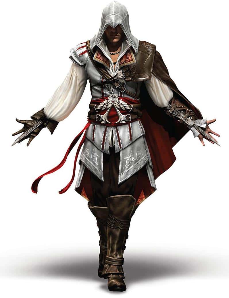
It's a very cool picture that can be used for just about nothing. Look at it, it's important features branch out on all sides. The entire thing is what makes it interesting to look at. You couldn't get anything but his head in a regular tag, and in a vertical one it would be hard not to cut off his hidden blades, unless you made it so small that there would be weird empty space on the top and bottom (or otherwise very square). Finally, even if you did manage to position it so it looked decent, what would you do? As awesome a standalone picture it is, there's zero action.
|
|
| Back to top |
|
|
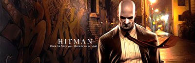
Hitman
Master Cheater
 Reputation: 9 Reputation: 9
Joined: 21 Sep 2008
Posts: 385
Location: Toronto
|
| Posted: Fri Jul 02, 2010 11:51 am Post subject: |
|
|
phox is right
look how shit this sig turned out (my brothers w-bb account, he requested it in gfx section, someone made it)

_________________
|
|
| Back to top |
|
|
|