 |
Cheat Engine
The Official Site of Cheat Engine
|
| View previous topic :: View next topic |
| Author |
Message |
1929394839292057839194958
Grandmaster Cheater Supreme
![]() Reputation: 130 Reputation: 130
Joined: 22 Dec 2006
Posts: 1508
|
 Posted: Wed Jun 30, 2010 3:38 pm Post subject: SOTW 1 - Critique from konr & Viral Posted: Wed Jun 30, 2010 3:38 pm Post subject: SOTW 1 - Critique from konr & Viral |
 |
|
konr -
Gogodr:

A nice idea, but honestly the blood doesn't look like it's actually there. It looks like the top part of it is just floating in midair, to me. You've executed mostly everything else well enough, but the concept is too bland for me to choose this one. Sorry bud. Try to add more interesting things next time to add that 'wow factor'.
Chidori:

Again, a nice try, but to me it seems apparent that in the bit just left of the middle of the signature, you've flipped that picture of a nebula and just smudged/changed it's colours a bit to fix it up. That usually does work, but the white line I see is sorta a putoff to a perfectionist prick like me. Smudging is okay, but could have more shadows and add more depth. Needs a bit more contrast, because it's undercontrasted. Nice try mate.
Cryoma/Stone:

Not really much I can say about this, but I do like the concept a lot. It's very.. different. I'm not actually sure what you've done yourself here so it's hard to give CnC. If you tell me the process you went through, I can try to CnC if you want. I'm gonna give this an honourable mention, for creativity. I really hope you haven't just put a stock in a weird frame :/
To0k:

A nice job with the effects, but it really doesn't look like any of it should.. be there? Hard to explain. Uh, the effects just look like they're there just for the sake of being there. I'd like to see you put some effort into making a signature look like the effects have something to do with the character. An example would be your current effects, but golder and around Goku from DBZ. That would make sense. Get what I mean? Very close to honourable mention, though.
Stylised:

A nice try, but the light source is far too bland and the smoke looks far too cartoony. I know TF2 has a rather cartoony feel to it but that's just a style of art that was going around in the 50s alot, not actual cartoon. If you made the smoke a bit more realistically (this can be achieved with round blob smudge brushes, and low settings), added a better light source (try out filter > render > lighting effects, and use new layers with soft brushed white, set to soft light but on a very low opacity. A few of these can make a huge difference) and made the effects on him less obviously a default scratch filter, then I think you could do much better.
Hitman:
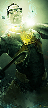
As it goes, I love this one. The stock was exceptional from the start anyway (nice find) and the only real problem is that you can't tell what he's doing. He looks decapitated, and I think next time you make a sig like this make sure you think about what is going to be seen and what people will think about the situation the character is in. If you're going to do this kind of thing, make sure it's completely apparent what is happening, or make your own concept up and make that apparent. He looks like he's been decapitated. Also the effects around his head look way too blocky. Smudge them or something to make them less 'displacementmappy' or 'distortfilterwhorey'. I'm still gonna give this the winner title, though.
Winner: Hitman
Honourable mention: Cryoma/Stone
Viral:
Gogodr:
http://img686.imageshack.us/img686/2049/valve2.jpg
For a piece like this, it should atleast look realistic.
As it is, everything on it looks absolutely fake.
Experiment further with blending modes and such, I like that you've put some lighting in that attracts attention to the blood/logo, but there's not much to look at (blood is also wrong colour).
Good try.
Chidori:
http://img228.imageshack.us/img228/781/ellissotw.png
The effects all seem pretty random, and unrelated to the theme, however the colours are pretty good and there's certainly some flow in there.
A little extra something to make him stand out (just something subtle) would do this wonders.
As Connor said, a little more contrast would be good.
I can't say I disagree with the stock flip, I wouldn't have noticed that had Connor not mentioned it. Not something to worry about.
I'm giving this runner up.
Stone:
http://i46.tinypic.com/155jmfs.jpg
Don't really get what's going on here tbh. Strangely appealing, but very odd. Good job thinking outside of the box.
To0k:
http://i46.tinypic.com/2d8ewrq.jpg
The effects look somewhat poor (clipping masks?) and they've actually reduced the quality of the image that you were working with (left side of spy's face is strangely coloured, arm border is pixellated, more blending needed).
What Connor said about the effects was spot on.
Stylised:
http://img191.imageshack.us/img191/6156/maggots.png
Imho this could've been fucking awesome if you'd had some sort of 'peeling off' effect, where it changes halfway through the image from looking flat to 3D. I think it needs more of a concept behind it (something like I just mentioned could signify the transition from the very cartoony style TF2 started off as to what it is today).
Just a thought.
Not bad though, smoke looks nice.
It's all very dark/dull/flat.
Get the render sticking out more.
Hitman:
http://forum.cheatengine.org/files/hl2sharpest_126.png
I love the bottom half of this.
The effects fit the game, and it looks excellent. Few things like the blue lines (c4d?) and the yellow text could be dealt with though.
The top is a bit chaotic, the effects don't really make sense.
It also looks a bit too oversharpened.
Despite that, it's the most visually appealing here, and definitely stands out.
Work on a concept in future.
tl;dr: Winner: Hitman. Runner up: Chidori.
|
|
| Back to top |
|
 |
hcavolsdsadgadsg
I'm a spammer
![]() Reputation: 26 Reputation: 26
Joined: 11 Jun 2007
Posts: 5801
|
| Posted: Wed Jun 30, 2010 4:12 pm Post subject: |
|
|
ahahha this one owns if you actually did the fremman edit.
|
|
| Back to top |
|
|
To0k
How do I cheat?
![]() Reputation: 14 Reputation: 14
Joined: 16 Nov 2007
Posts: 0
|
| Posted: Wed Jun 30, 2010 4:13 pm Post subject: |
|
|
I know I kind off failed on my sig ;_;
Thanks for the feedback though, il try to work on it on sotw 2.
And congratz to hitman!
|
|
| Back to top |
|
|
ShinjiHirako
Newbie cheater
![]() Reputation: -1 Reputation: -1
Joined: 19 Jun 2010
Posts: 13
|
| Posted: Wed Jun 30, 2010 6:03 pm Post subject: |
|
|
Nice signature works
_________________
Newengine...aahh,good old days. |
|
| Back to top |
|
|
trebor
Grandmaster Cheater
 Reputation: 21 Reputation: 21
Joined: 23 Dec 2007
Posts: 816
|
| Posted: Wed Jun 30, 2010 6:07 pm Post subject: |
|
|
Imo, Chidori or Cryoma should've won this one, but then, I'm not a judge.
Congrats to winners.
|
|
| Back to top |
|
|
Stylised
Grandmaster Cheater
 Reputation: 20 Reputation: 20
Joined: 04 Nov 2008
Posts: 712
|
| Posted: Wed Jun 30, 2010 10:20 pm Post subject: |
|
|
Ok Spruce up my sig more.
Lighting effects.
Make the render stick out more.
Better effects on render.
And make the sig kind of fit together like everything belongs.
Thanks alot guys.
|
|
| Back to top |
|
|
Cryoma
Member of the Year
![]() Reputation: 198 Reputation: 198
Joined: 14 Jan 2009
Posts: 1819
|
| Posted: Thu Jul 01, 2010 2:23 am Post subject: |
|
|
Ok so basically I took a pic of two guys in a dojo practicing with hand-to-hand weapons, I shopped in Gordan's head and a crowbar, added some effects, and threw in a subtle lambda on the side.
So yes, it was from scratch, no stocks or renders, and I appreciate the honorable mention.
Congrats to Hitman.
|
|
| Back to top |
|
|
sponge cake recipe
Grandmaster Cheater Supreme
![]() Reputation: 22 Reputation: 22
Joined: 24 Sep 2007
Posts: 1635
|
| Posted: Thu Jul 01, 2010 3:20 am Post subject: |
|
|
^
mmmm, thought you might have
crowbar: shadow is wrong, chunk missing, position in hand is wrong /odd
from a distance it looks good, but once you take a good look it has lots of flaws.
If you're going to keep a sig minimal like that make sure you get everything perfect.
Glasses are ehh.
Still, I commend you on the different approach, if that's not clear.
|
|
| Back to top |
|
|
|
|
You cannot post new topics in this forum
You cannot reply to topics in this forum
You cannot edit your posts in this forum
You cannot delete your posts in this forum
You cannot vote in polls in this forum
You cannot attach files in this forum
You can download files in this forum
|
|

