| View previous topic :: View next topic |
| Author |
Message |
Rawrtard
Grandmaster Cheater Supreme
 Reputation: 0 Reputation: 0
Joined: 06 Apr 2009
Posts: 1022
Location: Your mums pants with charlie the unicorn
|
 Posted: Tue Jun 09, 2009 8:26 am Post subject: First 3 sigs Posted: Tue Jun 09, 2009 8:26 am Post subject: First 3 sigs |
 |
|
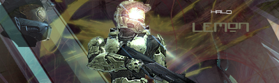

I liked the first 2 better but thought the other one was good as well. CnC appreciated. I think there good for first 3.
_________________
 
| Rawss. wrote: | | I put cups up my ass when im nervous. |
|
|
| Back to top |
|
 |
Phox
I post too much
 Reputation: 110 Reputation: 110
Joined: 11 Nov 2008
Posts: 2034
|
| Posted: Tue Jun 09, 2009 8:29 am Post subject: |
|
|
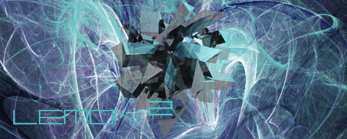
| I actually like #3 the best. 2 and 3 both very nice abstract works.
|
|
| Back to top |
|
|
superweapons
Grandmaster Cheater Supreme
 Reputation: 2 Reputation: 2
Joined: 04 Jan 2008
Posts: 1355
Location: The Internet. Where else?
|
| Posted: Tue Jun 09, 2009 8:35 am Post subject: |
|
|
They look more like renders placed on top of C4Ds/stocks. The use of lens flare messes them up even more. There's not really any flow, and the placement of some objects (especially Master Chief's head in the first sig) is unneeded and could use much revision. You might also want to experiment with depth and borders. Overall, they're really messy and have a lot of room for improvement.
If you still are going to only layer stocks over one another, try to improve the blending through blending methods and using smudging as well as brushes.
_________________
|
|
| Back to top |
|
|
Rawrtard
Grandmaster Cheater Supreme
Reputation: 0
Joined: 06 Apr 2009
Posts: 1022
Location: Your mums pants with charlie the unicorn
|
| Posted: Tue Jun 09, 2009 9:14 am Post subject: |
|
|
Thanks Im really a epic noob at this so thanks for the constructive criticism
_________________
| Rawss. wrote: | | I put cups up my ass when im nervous. |
|
|
| Back to top |
|
|
omegalordm
Cheater
 Reputation: 0 Reputation: 0
Joined: 07 May 2009
Posts: 25
|
| Posted: Tue Jun 09, 2009 10:21 am Post subject: |
|
|
| the fractals dont really fit the 2nd one is kinda ok but the text sux
|
|
| Back to top |
|
|
Phox
I post too much
Reputation: 110
Joined: 11 Nov 2008
Posts: 2034
|
| Posted: Tue Jun 09, 2009 10:42 am Post subject: |
|
|
| In #3, make the text the TINIEST bit darker, the "N" is hard to see.
|
|
| Back to top |
|
|
omegalordm
Cheater
Reputation: 0
Joined: 07 May 2009
Posts: 25
|
| Posted: Tue Jun 09, 2009 10:48 am Post subject: |
|
|
| Extra question is the 3rd one made by you in Cinema 4D?
|
|
| Back to top |
|
|
Mobsy
Master Cheater
 Reputation: -1 Reputation: -1
Joined: 05 Feb 2008
Posts: 288
Location: root
|
| Posted: Wed Jun 10, 2009 1:18 pm Post subject: |
|
|
I like 3 the best, but I also like the fusion of abstract & non-abstract in 1, although the MC's head doesn't look right.. 2 is probably the one I least like, not because its bad but because there just seems like the is something wrong on the right side (maybe too simple/empty in contrast to the left?).
Or perhaps the waves in the background are too defined and take the wolf's "standoutness"?
Maybe if you took the waves away and left the circular chapes in the background it would look better, although in that case the wolf may be too much for a background so subtle and dim.
Idk. But still, not bad.
_________________

Hitler, where's my car? |
|
| Back to top |
|
|
|


