 |
Cheat Engine
The Official Site of Cheat Engine
|
| View previous topic :: View next topic |
| Author |
Message |
S3NSA
:3
 Reputation: 1 Reputation: 1
Joined: 06 Dec 2006
Posts: 1908
Location: England.
|
 Posted: Mon May 18, 2009 5:29 am Post subject: SOTW #1 Winner and C&C. Posted: Mon May 18, 2009 5:29 am Post subject: SOTW #1 Winner and C&C. |
 |
|
Well, first of all I would like to thank everyone who participated, it's good to see people trying and coming up with some unique artwork. In this thread I'll unveil the winner and post the C&C of the judges on some of your work, don't be disheartened if you didn't win, just take the advice on board and keep progressing!
Well this one was a very close choice, only one vote decided between the winner and the honorable mention (second place). I was the one who had to make the cut decision based on the final votes but I can assure you both pieces are deserving of great praise.
The winner is To0k, congratulations mate, you impressed the judges with your unique and brilliant take on the theme enough to grab first place in the competition!

The honorable mention goes to Doomsday, well done to him also!

///
Judges' Critique:
S3NSA:
iNcor:

Thoughts: I really quite like this sig, it's simple yet harrowing with some nice colors. However, I do think that the lines on the right are too geometric considering the curve of an eclipse. Good response to the theme, albeit not polished.
Viral:

Thoughts: The background on this is nice but wondering if it was pre-made or not. Solar flare is handled well as is the eclipse on the whole. Colours are also good. Only fault I have with it is the typography, which seems rather graffiti-esque and doesn't fit the brief in my opinion.
Kronos:

Thoughts: A good attempt to break away from the traditional Eclipse theme (for there actually are a few ways to portray an Eclipse) however with the colours being the only thing that's abstract it loses its purpose, getting stuck between a normal sig and one trying to be abstract, especially with the white outer glow, which denies instantly the colours.
Chidori:

Thoughts: Not too much to go by on this, pretty dull. Looks like a black ball with some smudged white and a solar flare. Ironically the typography is actually pretty good (the choice of font as opposed to placement).
Oblivious:

Thoughts: Although I get the concept behind the "Eclipse" it isn't answering my brief. There's a distinct lack of what I asked for (the astronomical event), the typography is handled well though and I think credit where credit's due. Unfortunately with not answering the brief that credit won't be winning him the competition.
r34p3r:
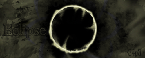
Thoughts: Black Hole or Eclipse? If we're thinking the latter it is a little too grungy for my tastes but being un-bias I do like the concept, the light wraps around the planet as if creeping forth and it's definitely something to focus on. The blue around it keep your eye in that center but with enough allowance to keep you looking around it. To be fair I think it is a good response, I am actually surprised a how good it is as I hadn't seen too much of reaper's work before, especially anything of quality from Photoshop. Again with so many people the typography is the let down, it's a big risk allowing it to take up so much space, especially if you don't know what you're doing. A smaller "Eclipse" would have been nice and less contrast with the "r34p3r" on the bottom right, it's too thin and when you collide a small, thin sans-serif with a large, chunky serif, things are bound to go array.
Frederick'3Rd:
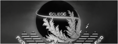
Thoughts: Perhaps it's just me but not really an eclipse, at least I was unaware that light bent around a planet in the shape of a fern. If you ignore the two "fred"s on the bottom then the type is handled well. I think it's a good piece looks-wise but it's the lack of relevance to the theme that I find disconcerting. The background is handled well, with just enough lighting, it does look somewhat more like cloud than space though.
Connor:

Thoughts: Good concept and one I like. I was interested to see what Connor would produce since he does like abstract (not that this contest had to be, I'll explain later). The concept is brilliant. If anyone has seen an eclipse then you would realize that the only thing in focus is the black, the light does distort as is burst out from behind it. Obviously not to that extent but it's still something which has been realized. The only let down in my opinion is the colour choice, the gold is really too dull when you consider the excitement and energy of the event. Perhaps a nice blue or a lighter yellow would have fit better, without experimenting I cannot say but the gold definitely sucks something out of it.
Clairenix:

Thoughts: I really do like the Eclipse in this, quite why it is split in half I don't know but it works well. The lighting does look rather "Northern-lights-esque" which is a shame as less variation could ahve been better. The typography is bold and seems confident or at least experimental, which must be commended as it shows a will to improve. Next time leave the "C" and the "E" in their own size and font, keeping the 'C' a capital and the 'E' in lower case. That would look brilliant (from picturing it in my mind). Remember to concentrate on your colour variation, study the colour wheel and pick a few palettes you like, work with them.
Deletion:

Thoughts: This signature irritates me. It's a really, really nice outcome but it's just too blank on the left side. Which is really, really annoying as I am really impressed with the eclipse itself. There's something very pleasant in this style, it's very graphic and it's simplicity is met with enough detail to keep you looking. Good response to the brief and would be nigh on perfect in my eyes had the composition been worked on more.
Reisin:
Thoughts: OK, I've tilted my monitor down, all I see is a massive pair of lips. Nicely produced sig ignoring the last point, lighting is curved well and well, is brilliant on the whole. A really nice little signature. Shame then, that there is a block of flat colour on the right, which does nothing for the signature. I suggest putting more consideration into the border next time.
CAD:
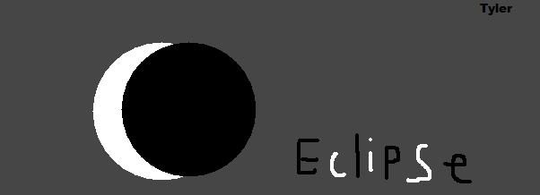
Thoughts: Oh Tyler lol, what shall we do with you. The amusing thing is you came the closest to breaking the mould that everyone else sunk into. You were really close to discovering it, though I'm sure you'll readily admit it was an accident :3
Gogodr:

Thoughts: Nice render. Ugly background. Looks like a window which has just been sneezed on. Smaller type is needed. I like the lighting lines but they perhaps need to be a bit more faint.
To0k:
Thoughts: Wow. Well I must say brilliant job and response. Though it's not what I had thought of when I said "different perspectives" it's certainly a good idea. I'm interpreting it as I see it, and I'm seeing a reflection of an eclipse in a muddy puddle. With it coming through between a tree canopy. It's certainly endearing and interesting and the eclipse is still as clear as day. Nice subtle typography just means this piece pretty much ticks my boxes.
Doomsday:
Thoughts: Interesting concept and well realized. The almost-patterned lighting is a new one but you have got it to work well. Nice colours as well. Inclusion of scattered stars is nice and again, does nothing to inhibit this piece. Good job.
Banaantje:

Thoughts: I will admit that I first thought this and wondered why Daphne had entered the Death Star into the competition. Some interesting effects but it's too diverse in my opinion to get a real feel for an eclipse, the lighting on the right seems random and unconsidered, the silver doesn't bode well with the brightness of the white and light blue. The type, however, is nice and small and works well.
Final Comments to contestants:
Bit unsure why most of you thought that an eclipse meant you could only do a black ball with light behind it. Why not consider what an eclipse looks like at different angles, like that from the side, from the view of the sun etc? Would make way for interesting light flows and gradients where C4D's wouldn't go amiss. On the whole, despite missing out on that opportunity, some really good entries. I hope you all learn a bit form the C&C, it took awhile to get through.
//
Moderator:
Doomsday
Pretty nice and cool, have an awesome flow, and i kinda liked the way he did the eclipse's light source. It weren't just a copy like everyone else.
Viral's, The background and the flare were perfectly done until he had to ruin it with the smudge & graffiti front.
Seems like the author of this didn't put much effort onto this work. Its quite empty and the flare position is wrong.
I kinda like this one, sadly he used same technique on the eclipse/planet and background. Became too... How should i say this, cheap?
i lol'd....
I am having a hard time relating this to an eclipse.
_________________
~ You can find me on irc.ccplz.net x
Last edited by S3NSA on Mon Jun 01, 2009 3:46 am; edited 2 times in total |
|
| Back to top |
|
 |
sponge cake recipe
Grandmaster Cheater Supreme
![]() Reputation: 22 Reputation: 22
Joined: 24 Sep 2007
Posts: 1635
|
| Posted: Mon May 18, 2009 5:33 am Post subject: |
|
|
Congrats everyone!
I'd C&C but capped internet is making it take forever to load.
Well done, good entries from those that I remember.
:3
Also, I'd like to add, isn't the theme more of a guideline for what you make, rather than it having to be all the same?
There's only so many different ways you can show an eclipse without variables.
Last edited by sponge cake recipe on Mon May 18, 2009 5:37 am; edited 1 time in total |
|
| Back to top |
|
|
SimmerSunny
Master Cheater
 Reputation: 0 Reputation: 0
Joined: 08 Nov 2007
Posts: 286
Location: Home.
|
| Posted: Mon May 18, 2009 5:35 am Post subject: |
|
|
| Congratulations ToOk! I was happy that I tried.
|
|
| Back to top |
|
|
S3NSA
:3
Reputation: 1
Joined: 06 Dec 2006
Posts: 1908
Location: England.
|
| Posted: Mon May 18, 2009 5:44 am Post subject: |
|
|
| Viral wrote: | Also, I'd like to add, isn't the theme more of a guideline for what you make, rather than it having to be all the same?
There's only so many different ways you can show an eclipse without variables. |
We took this opinion from the general consensus and as a result have made this weeks theme more loose.
_________________
~ You can find me on irc.ccplz.net x |
|
| Back to top |
|
|
Strathe
Grandmaster Cheater
![]() Reputation: 0 Reputation: 0
Joined: 16 Aug 2006
Posts: 700
Location: Middle of nowhere.
|
| Posted: Mon May 18, 2009 5:45 am Post subject: |
|
|
My favorite one is Fred's for the style.
But ToOk's rely more on the topic. (More realistic).
I'm gonna try to enter the new contest, although i'm just starting.
I might progress =]
|
|
| Back to top |
|
|
SimmerSunny
Master Cheater
Reputation: 0
Joined: 08 Nov 2007
Posts: 286
Location: Home.
|
| Posted: Mon May 18, 2009 5:47 am Post subject: |
|
|
| Strathe wrote: | My favorite one is Fred's for the style.
But ToOk's rely more on the topic. (More realistic).
I'm gonna try to enter the new contest, although i'm just starting.
I might progress =] |
Thanks! And also good luck in the next SoTW, I'll also be entering.
|
|
| Back to top |
|
|
Kronos
Grandmaster Cheater Supreme
 Reputation: 0 Reputation: 0
Joined: 15 Dec 2008
Posts: 1606
Location: wtf
|
| Posted: Mon May 18, 2009 5:50 am Post subject: Re: SOTW #1 Winner and C&C. |
|
|
Grats to the winner, good job.
| S3NSA wrote: |
I am having a hard time relating this to an eclipse. |
I lol'd...
_________________
|
|
| Back to top |
|
|
To0k'
Grandmaster Cheater
![]() Reputation: 0 Reputation: 0
Joined: 29 Jul 2009
Posts: 921
|
| Posted: Mon May 18, 2009 6:13 am Post subject: |
|
|
Wow, never expected I would win CEF's first SOTW, thanks to all of you =). *happiness*
Now, up to SOTW#2
|
|
| Back to top |
|
|
gogodr
I post too much
 Reputation: 125 Reputation: 125
Joined: 19 Dec 2006
Posts: 2041
|
| Posted: Mon May 18, 2009 6:17 am Post subject: |
|
|
Gratz, that one was my favorite to win the sotw
** now ish working on my next entry **
|
|
| Back to top |
|
|
Clairenix
Grandmaster Cheater
 Reputation: 5 Reputation: 5
Joined: 19 Dec 2007
Posts: 715
|
| Posted: Mon May 18, 2009 7:20 am Post subject: |
|
|
Gratz to the winner. Thanks for the C&C. And yes S3NSA my text was experimental; I was trying to figure out more tricks with font >_>.
Also Moderator, I'll try to do less cheap stuff ;-;
_________________
Last edited by Clairenix on Mon May 18, 2009 7:55 am; edited 1 time in total |
|
| Back to top |
|
|
MiguelKN2
Master Cheater
 Reputation: 0 Reputation: 0
Joined: 05 May 2009
Posts: 282
Location: Venezuela
|
| Posted: Mon May 18, 2009 7:42 am Post subject: |
|
|
i dont doubt it Good sigs
_________________
But hey that's just my opinion |
|
| Back to top |
|
|
zyndr0m
I post too much
 Reputation: 4 Reputation: 4
Joined: 23 Oct 2007
Posts: 4358
Location: Japan!
|
| Posted: Mon May 18, 2009 8:12 am Post subject: |
|
|
As always, i did not mean to harm or cause any pain. Take it as constructive critisism. You all did a great job, and remember this was just one and our very first SOTW, many more are coming.
Best regards Z.
|
|
| Back to top |
|
|
DoomsDay
Grandmaster Cheater
 Reputation: 0 Reputation: 0
Joined: 06 Jan 2007
Posts: 768
Location: %HomePath%
|
| Posted: Mon May 18, 2009 8:52 am Post subject: |
|
|
Congratz to0k!
I'll better get working on SOTW #2, thanks for the comments :)
|
|
| Back to top |
|
|
1929394839292057839194958
Grandmaster Cheater Supreme
![]() Reputation: 130 Reputation: 130
Joined: 22 Dec 2006
Posts: 1509
|
| Posted: Mon May 18, 2009 9:19 am Post subject: |
|
|
Congrats Ralph 
S3NSA, I truly have no idea how you interpreted Ralph's tag as such a detailed concept lol. I didn't think of it like that. You have a gift :3
|
|
| Back to top |
|
|
Josef Fritzl
Master Cheater
 Reputation: 0 Reputation: 0
Joined: 17 Jan 2008
Posts: 496
|
| Posted: Mon May 18, 2009 12:05 pm Post subject: |
|
|
| LOL U DUN LIEK COKEFAG'S GOATSE SIGNATURE, MAX?
|
|
| Back to top |
|
|
|
|
You cannot post new topics in this forum
You cannot reply to topics in this forum
You cannot edit your posts in this forum
You cannot delete your posts in this forum
You cannot vote in polls in this forum
You cannot attach files in this forum
You can download files in this forum
|
|


