| View previous topic :: View next topic |
| Author |
Message |
Sharpies!
Master Cheater
 Reputation: 0 Reputation: 0
Joined: 13 Dec 2006
Posts: 433
Location: Somewhere, Anywhere, The World.
|
 Posted: Mon May 04, 2009 8:04 pm Post subject: Sig Gallery! Wheee! (Updating occasionally) Posted: Mon May 04, 2009 8:04 pm Post subject: Sig Gallery! Wheee! (Updating occasionally) |
 |
|
Been trying to learn photoshop on and off along with school/gaming/life in general for around 4-6 months now, idk.
Haven't had a whole lot of time, and some of my oldest stuff is REALLY, REALLY bad... so just a few of my latest stuff here. x]
You guys are probably really tired of people asking for critiques about sigs, but comments and suggestions would be super appreciated. (As would ideas/links for renders, I don't have that many on me.)
Thanks ;o
Edit: so many epic people on this forum make me want to keep going along with this. I'll throw in new ones occasionally, so check back!
| Description: |
NEW ONE.
Tried making a sig while babysitting. o_o |
|
| Filesize: |
105.97 KB |
| Viewed: |
17413 Time(s) |

|
| Description: |
|
| Filesize: |
111.36 KB |
| Viewed: |
17574 Time(s) |

|
| Description: |
|
| Filesize: |
88.06 KB |
| Viewed: |
17574 Time(s) |

|
| Description: |
|
| Filesize: |
78.44 KB |
| Viewed: |
17574 Time(s) |
|
_________________
Last edited by Sharpies! on Tue May 05, 2009 4:36 pm; edited 1 time in total |
|
| Back to top |
|
 |
Phixen
I post too much
![]() Reputation: 0 Reputation: 0
Joined: 27 Oct 2008
Posts: 4123
|
| Posted: Mon May 04, 2009 8:20 pm Post subject: |
|
|
Hmm, I must say, I like them, but don't use scanlines, they made them ugly. D: You're pretty good at blending the render. Don't always place the texto nthe corners or near it, it ruins the focal. Also, don't give the text a glow, that's not the focal now, is it? I like the second one most.
Last edited by Phixen on Mon May 04, 2009 8:30 pm; edited 1 time in total |
|
| Back to top |
|
|
Children
Grandmaster Cheater Supreme
 Reputation: -1 Reputation: -1
Joined: 05 Jan 2008
Posts: 1521
Location: Squidward's Left Testicle
|
| Posted: Mon May 04, 2009 8:27 pm Post subject: |
|
|
In all of them, the color is really off. Or at least i think it is.
_________________
Look At Squidward GO. <3 |
|
| Back to top |
|
|
Oblivious
Grandmaster Cheater Supreme
![]() Reputation: 45 Reputation: 45
Joined: 12 Mar 2008
Posts: 1732
|
| Posted: Mon May 04, 2009 8:29 pm Post subject: |
|
|
| They aren't by any means pro, but they are better than a lot of the shit people post.
|
|
| Back to top |
|
|
Phixen
I post too much
![]() Reputation: 0 Reputation: 0
Joined: 27 Oct 2008
Posts: 4123
|
| Posted: Mon May 04, 2009 8:29 pm Post subject: |
|
|
| diplodocus wrote: | | In all of them, the color is really off. Or at least i think it is. |
Maybe adjust your desktop color settings a bit?
|
|
| Back to top |
|
|
Volcom880
Grandmaster Cheater
 Reputation: 0 Reputation: 0
Joined: 16 Jan 2007
Posts: 942
|
| Posted: Mon May 04, 2009 9:34 pm Post subject: |
|
|
Im not sure If your doing any requests, but if you are I'll send you my ideas. I love your work : ]
<3
|
|
| Back to top |
|
|
Cloud_FFVII_AC
Advanced Cheater
 Reputation: 0 Reputation: 0
Joined: 15 Feb 2009
Posts: 91
Location: Australia
|
| Posted: Tue May 05, 2009 2:57 am Post subject: |
|
|
the flame ones is pretty sweet. good blending.
scanlines are bad, except for userbars of course
the camera one just look right. the backgrounds good but the render seems wierd. i hate making sigs from real life pics
_________________
imma newfag  |
|
| Back to top |
|
|
Censored
Master Cheater
 Reputation: 0 Reputation: 0
Joined: 30 Dec 2006
Posts: 441
Location: Suspended animation
|
| Posted: Tue May 05, 2009 5:49 am Post subject: |
|
|
| I liked the last one.
|
|
| Back to top |
|
|
1929394839292057839194958
Grandmaster Cheater Supreme
![]() Reputation: 130 Reputation: 130
Joined: 22 Dec 2006
Posts: 1508
|
| Posted: Tue May 05, 2009 9:29 am Post subject: |
|
|
Flamey army dude :-
Overall a good signature but I think it would have been much better if you varied in colour more instead of just having one patch of blue and the rest red. Also, the scanlines ruin it so much. The text should have been left out too. Overall I think that without the said things prior to this (And with the things I suggested) the depth would be quite good and the signature would be pretty cool. Although, I can see evidence of the render being covered by something (His arm) which should never be done to that extent.
Camera snap redo :-
I like the concept, sortof. Once again teh scanlines ruin it so much that I want to puke and the text sucks. I'd suggest staying off text for a while until you've got better at the signatures themselves. The signatures doesn't seen very depthy. The man looks like a different picture and the background doesn't really coincide with it. I suggest a better light source (Possibly use Lighting effects. Filter > Render > Lighting effects. Play around with it until you get used to it.) and better colouring. At the moment it's too bright and it looks like you gaussian blurred the applied image and then set it to lighten, which isn't a nice effect at all, it ruins sigs. Much like scanlines.
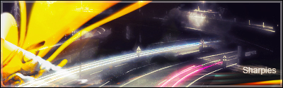
Street Light v2 :-
I don't really see much done with this. It looks like a yellow C4D just eratically placed ontop of a picture of a motorway. I suggest you change the colour of the C4D with either colour replacement or hue and saturation settings. Which can both be found by clicking the half black half white yin&yang circle looking thing which is located at the bottom of the layers panel. The text is a problem (Again) and you've once again used that awful gaussian blur + lighten effect.
|
|
| Back to top |
|
|
Sharpies!
Master Cheater
Reputation: 0
Joined: 13 Dec 2006
Posts: 433
Location: Somewhere, Anywhere, The World.
|
| Posted: Tue May 05, 2009 3:23 pm Post subject: |
|
|
Bahaha.
Connor sees right through me. ;[
And uh, I'm taking requests, KINDA. I need practice so send me anything that would look nice in a sig I suppose.
_________________
|
|
| Back to top |
|
|
|