| View previous topic :: View next topic |
| Author |
Message |
Phox
I post too much
 Reputation: 110 Reputation: 110
Joined: 11 Nov 2008
Posts: 2034
|
 Posted: Wed Jun 30, 2010 2:10 pm Post subject: Boba Fett Tag Posted: Wed Jun 30, 2010 2:10 pm Post subject: Boba Fett Tag |
 |
|
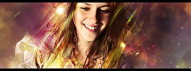
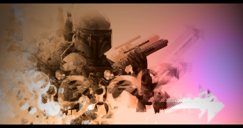
CnC, insults, flaming, all welcome. If anyone wants the psd or render, I have them. There's that little space on the bottom that text would look really nice on, but I'm not sure what font would look good. Suggestions would be appreciated.
| Description: |
|
| Filesize: |
114.89 KB |
| Viewed: |
8414 Time(s) |
|
|
|
| Back to top |
|
 |
Moments
Grandmaster Cheater Supreme
![]() Reputation: 17 Reputation: 17
Joined: 20 Mar 2008
Posts: 1196
|
| Posted: Wed Jun 30, 2010 2:32 pm Post subject: |
|
|
| Looks great, but the lighting is whaaaack
|
|
| Back to top |
|
|
Sharpies!
Master Cheater
 Reputation: 0 Reputation: 0
Joined: 13 Dec 2006
Posts: 433
Location: Somewhere, Anywhere, The World.
|
| Posted: Wed Jun 30, 2010 2:42 pm Post subject: |
|
|
Looks cool, brushing is actually pretty interesting, but yeah...
That shadow thing you have going on (example, the gun) seems kinda weird, and the way it gets dark toward the top is like.. wat.
_________________
|
|
| Back to top |
|
|
ShinjiHirako
Newbie cheater
![]() Reputation: -1 Reputation: -1
Joined: 19 Jun 2010
Posts: 13
|
| Posted: Wed Jun 30, 2010 5:55 pm Post subject: |
|
|
looks nice,but would be better if you removed the black bars.
_________________
Newengine...aahh,good old days. |
|
| Back to top |
|
|
Phox
I post too much
Reputation: 110
Joined: 11 Nov 2008
Posts: 2034
|
| Posted: Wed Jun 30, 2010 7:41 pm Post subject: |
|
|
I did spend a pretty long time brushing and positioning clipping masks, thanks for the compliment, Sharpies. About the lighting, you and Sorrow, I tried, and failed pretty badly, I'm not hesitating to admit it. What I did was I used a standard lighting effects filter on a white layer set to multiply, with a regular gradient (a tannish color to a greyish purple color) over it set to "hue". It came out a little weird. Anyone have some thoughts on how I should do lighting, or suggestions on a really good lighting tutorial? The gun getting darker, the render's like that, can't really be helped :<
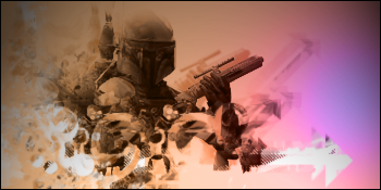
ShinjiHirako, here's a version with a regular 1px border rather than the letterbox border. You tell me if it's better, I don't think it really affects the whole look that much.
Oblivious, want to go into a tiny bit more detail?
Render, since it would probably help (it used to be bigger): 
| Description: |
|
| Filesize: |
113.84 KB |
| Viewed: |
8378 Time(s) |
|
|
|
| Back to top |
|
|
Hitman
Master Cheater
 Reputation: 9 Reputation: 9
Joined: 21 Sep 2008
Posts: 385
Location: Toronto
|
| Posted: Wed Jun 30, 2010 9:04 pm Post subject: |
|
|
When I first looked at it I didn't know what to look at or what it was :$
_________________
|
|
| Back to top |
|
|
Sharpies!
Master Cheater
Reputation: 0
Joined: 13 Dec 2006
Posts: 433
Location: Somewhere, Anywhere, The World.
|
| Posted: Wed Jun 30, 2010 9:20 pm Post subject: |
|
|
By "gets dark towards the top", I was referring to the tag in general, not just the gun part.
Uhh...
Instead of an ordinary gradient, use a gradient map (usually on multiply / screen / soft light with a low opacity), OR
If the intent of the orange/purple gradient was lighting, make it coincide with anything else you used to imply a light source. The purple/orange goes from right to left, but the lighting effects filter seems to originate from bottom right / bottom middle.
Also, for lighting, I tend to use the lighting to emphasize something (usually focal), not detract from something, as it does on the top left and right because it fades to black.
_________________
|
|
| Back to top |
|
|
1929394839292057839194958
Grandmaster Cheater Supreme
![]() Reputation: 130 Reputation: 130
Joined: 22 Dec 2006
Posts: 1509
|
| Posted: Thu Jul 01, 2010 8:41 am Post subject: |
|
|
| By dark he means dull. The colours become less vibrant and have less black in them.
|
|
| Back to top |
|
|
The Fish
Expert Cheater
![]() Reputation: 3 Reputation: 3
Joined: 11 Aug 2008
Posts: 114
Location: Ohio bitch
|
| Posted: Thu Jul 01, 2010 10:04 am Post subject: |
|
|
Remove the gradient.
try a gradient map at a lower opacity for something much nicer.
_________________
It was nice while it lasted. |
|
| Back to top |
|
|
|